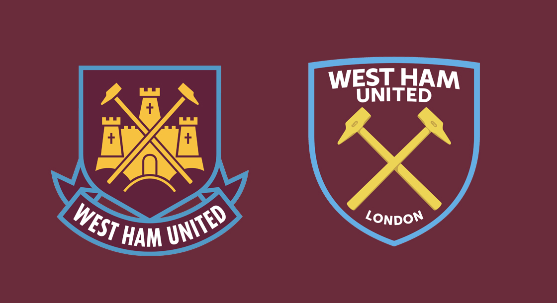
Why have so many football team badges been simplified into corporate logos?

Why have so many football team badges been simplified into corporate logos?

This trend is well-known to football (or soccer) fans.
For their teams to hire a consultancy, spend a fortune, and change their beloved crest, almost always in the form of simplificiation.
The most egregious recent case is Italian club Juventus, who changed their crest in 2017:

Other examples include Inter Milan, another Italian club, whose duochrome simplification was met with almost unanimous disdain in 2021.
The interesting thing is that it isn't just the fans of the club in question, but football fans more generally, who dislike such changes.

This culture of redesign has several common themes.
First, as in the case of Manchester City in 2016, for a more complex shape to be given a much simpler profile - usually as straightforward geometry, such as a circle.

Or, like West Ham in 2021, for symbols to be stripped of detail and reduced to their essence.
