Want to create a lead generating landing page?
Follow these 9 steps to create pages that convert at more than 50%…
There’s a surprise for those that read until the end…
•••THREAD•••
Want to create a lead generating landing page?
Follow these 9 steps to create pages that convert at more than 50%…
There’s a surprise for those that read until the end…
•••THREAD•••
I’ve created more than 10 pages that have converted at 50% or more now. While that doesn’t seem like much it took me awhile to get to that point.
Now some weeks they convert at 80% or higher!
Here’s exactly what you need to do to get the same results…
You need a good offer if you want to collect more emails.
This is done perfectly with a lead magnet. A lead magnet is a free product that you giveaway to anyone that signs up.
A good lead magnet is: • valuable to the reader • easy to digest • unique by itself
To figure out something your audience would like think about:
• what you wanted to know when first starting out • what would get you ahead • what secrets you can reveal • tips you’ve learned along the way
All of these ideas can be made into: • ebooks • checklists • etc.
Bold. Simple. Captivating.
Here are a couple of templates you can use: “FREE ___ Guide with 7 Examples” “17 ___ Rules You Must Know to Make 6-Figures…” “FREE ___ Checklist” “Mini-___ Guide for Beginners” “___ 7-Figure Case Studies for FREE”
Include the word “free”
You want to intrigue your reader more. If they read past your headline what would push them to signup even more?
This can be: • social proof • statistics • authority/credibility
Make it one sentence long and right below your headline.
You want a picture or teaser image of your product.
Make this: • the cover of your ebook • a page from the guide • a crazy online payment
Whatever you choose should give them an idea of what they’re in for.
The worst thing you can do is lie about what they get.
Bullet points are a great way of providing further information and intriguing the reader.
In these points your goal is to sell their future not your features.
No: Lead magnet guide
Yes: A way to start profiting off your audience
See the difference? Good…
Your CTA and bullet points should be the same bright color because you want them to stand out the most.
Your button can say: “Unlock Your FREE ___ Guide!”
Put the button at the bottom of the page. It should take your reader to a sign up form.
By the way… Button = CTA
Every email provider is different for how you can collect emails.
In most cases you’ll have to create a form and then integrate it with your page.
All you’ll need is to add a first name and email field.
The more simple the better.
There should only be four colors on your page: • background • main font color • your picture • CTA & bullet colors
Don’t overcomplicate this.
My usual recipe is: Background - #F7F7F7 (off-white color) Font color - #000000 (black) CTA & Bullets - anything
Best way to do this is to set up an automated email to delivery it to them.
This can be done in your workflows & automations.
Whenever someone signs up in X form > welcome email is sent with lead magnet attached/linked inside
These pages should be quick and easy to make.
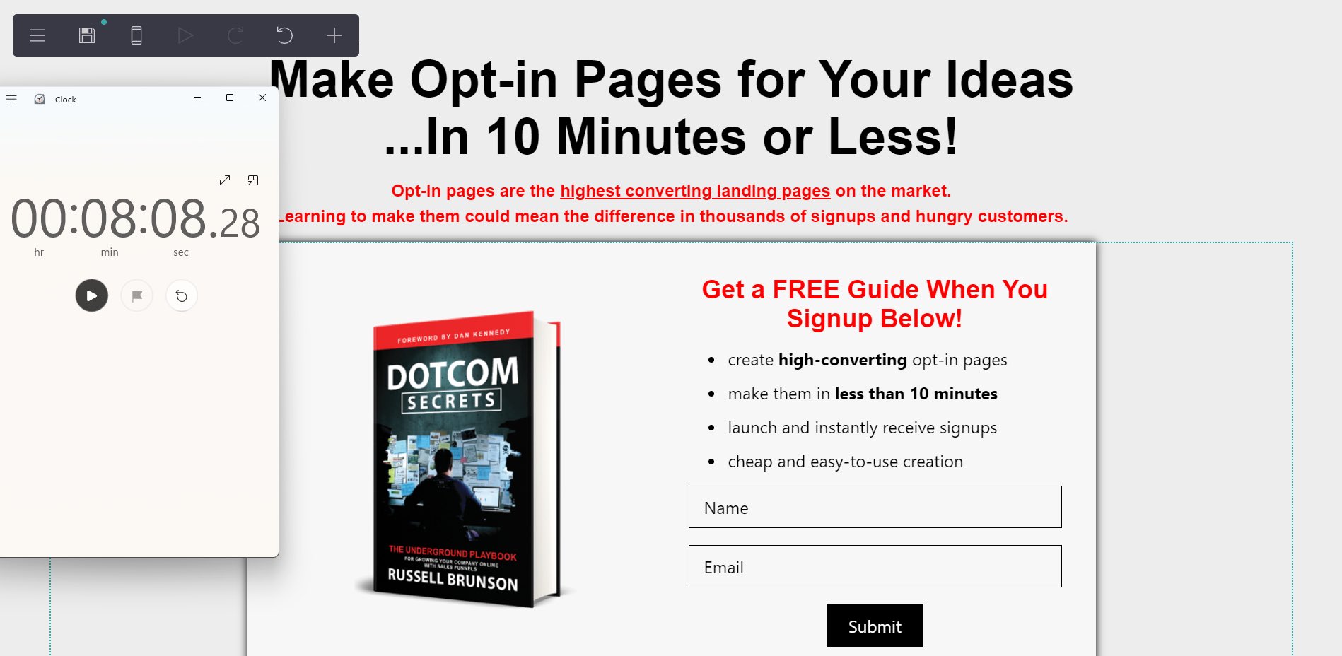
Here’s one that I made in just over 8 minutes:

And if you made it this far…
Here’s some more lead magnet tips + 111 FREE Lead Magnet Ideas: typhoon-veil-f07.notion.site/MINI-LEAD-MAGN…
No signup required :)