13 must-have elements on any landing page broken down…
An analysis of one of my favorite landing pages of all time:
13 must-have elements on any landing page broken down…
An analysis of one of my favorite landing pages of all time:
I came across this page recently and it checks every box.
It’s for a membership group but the principles can be applied for any product or program.
You’ll learn: • what’s vital to have on any converting page • how easy it is to do everything yourself • examples of everything
trust - ratings at the top, trusted companies at the bottom, payment processors under CTA
clear CTA - a bright green button
social proof - ratings at the top, personal review above CTA
product shot - on the left side
value proposition - headline kills it
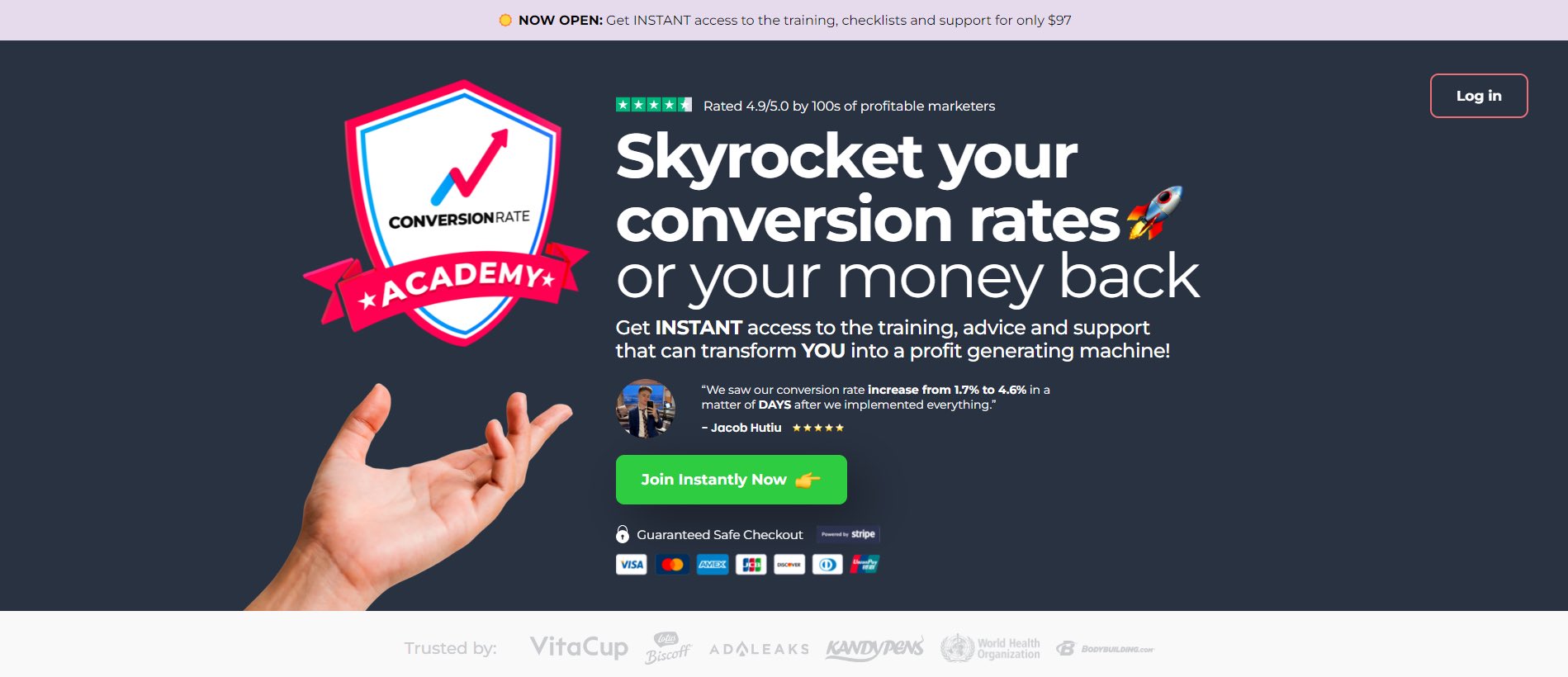
These 5 elements are essential if you can fit them all: • trust • clear CTA • social proof • product shot • value proposition
The first section on your page should grab people’s attention and make them want to read more.
A great headline is the first step.
The next two sections are dedicated to building interest for the reader.
First by listing out all the possible pain points that you might be experiencing.
Then by solving each pain point through a feature of the academy.
Emphasizing their solution.


Diving deep into the pain points of your ideal customer is important.
You need to show that you understand them so well, that you created the perfect solution for all their problems.
By this point the reader is asking: “You might have the solution but I don’t know who you are”
This is exactly where they introduce themselves.
I tend to have this section closer to the bottom of the page but I’ve seen more and more pages with it higher.
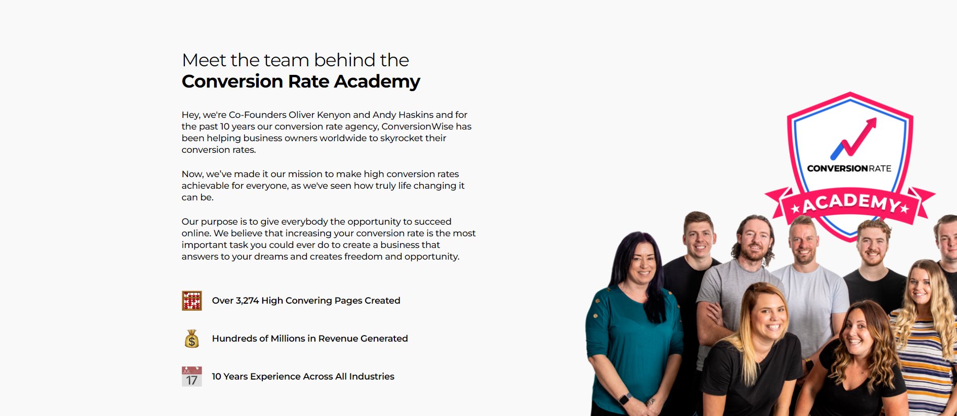
It’s important to have an “about us” section on your page if there’s a chance cold traffic might see it.
This way, people that don’t know you as well will get a little introduction.
It’s a great time to build authority as well.
Another piece of social proof is above the button with the star rating. It looks very natural which is great.
The button stands out and has an emoji in it.
Then the payment processors are shown to increase the trust of their checkout.

CTA’s should almost always include: • trust • emoji • social proof • high contrast
These little fixes will increase conversions across your page.
While some benefits have been stated most readers are probably still a little confused about what’s inside.
These three sections are made to: • show you how their solution can help you • explain why their solution is unique to others • excite you


Icons work really well here.
They keep the reader interested while also giving you a chance to explain the benefits of your solution.
It’s always important to show readers what they’ll be getting inside.
These sections should be benefit heavy and display the value in each piece that they’ll be receiving.
This paints the value much higher than what they charge you in the end.
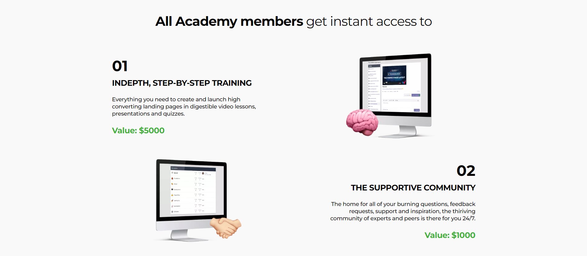


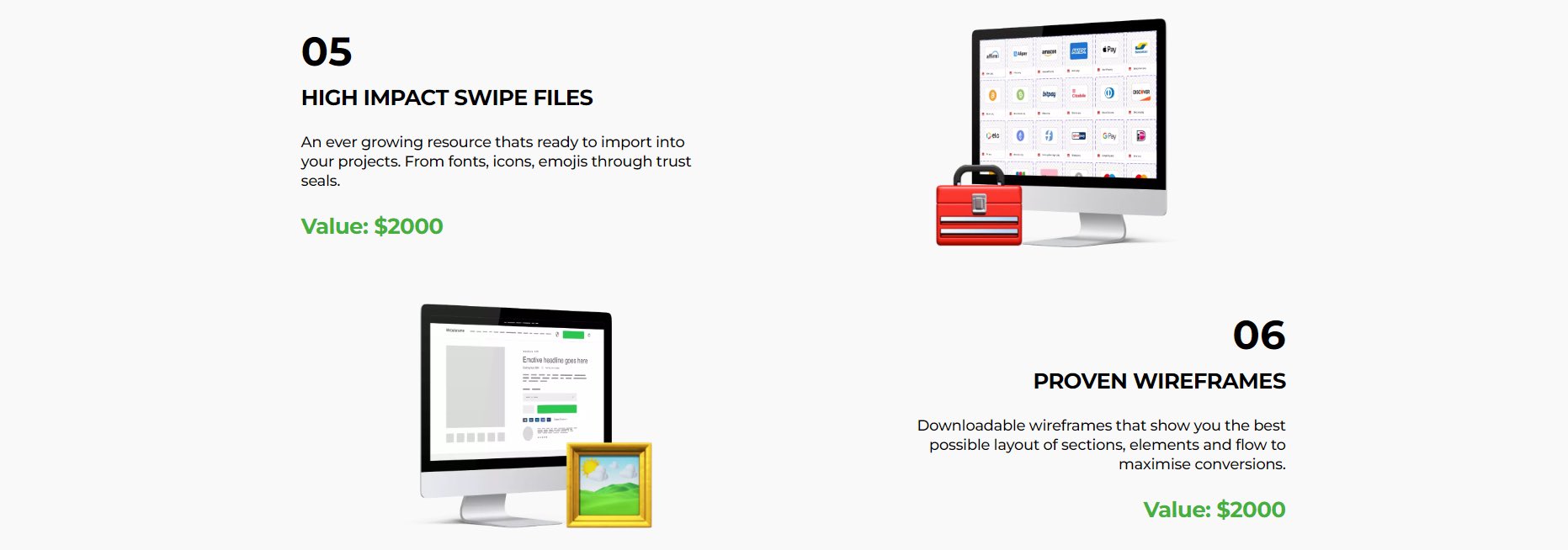
The best pages separate the ideal customers from the ones that will ask for a refund.
By including this section in your page you can push people off the fence and towards your product.
It’s a great way to qualify people. Anybody that purchases is ideal.


While it is important to have social proof scattered throughout the page (as seen above) you need a dedicated section for it as well.
Starts off with some more qualification and then goes straight into 15+ video and written reviews.
(link at the bottom to view)

Something that many people are scared to add to their site. But it’s necessary!
It’s an easy way to increase your: • sales • trust • authority
The amount of refunds you receive will be nothing compared to the increase in sales you get.

Every. Product. Landing. Page. Should. Have. This. Section.
• you display everything they’re getting • they see the value of everything • you cross it out and present the real price
Don’t go overboard here. Crazy prices will only scare people away.

The CTA here has the usual elements of: • trust • emoji • social proof • high contrast
But it also gives you options. Displaying which package is the “better deal” will increase your sales as well.
Mentioning the guarantee again is another great touch.

If someone reaches this point they either have a few more questions or just skipped to the bottom.
Either way this section is great for them.
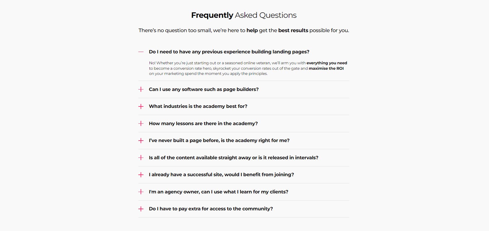
The accordion style FAQ is my favorite because it saves space and looks professional.
Your page should always end with a CTA.
They use all the elements mentioned above and include their guarantee popping out.
Nothing fancy on the footer because it doesn’t need to be.
All of the attention should go to your CTA.

That’s all I have for you today. You can check out the landing page here: conversionrateacademy.com
Shoutout to @oliverkenyon for putting together this beauty.
Reply below if you like breakdowns like this.
And DM me if you want a page like this built for yourself.