If you’re looking for a simple landing page for a Gumroad product… steal this one (breakdown):
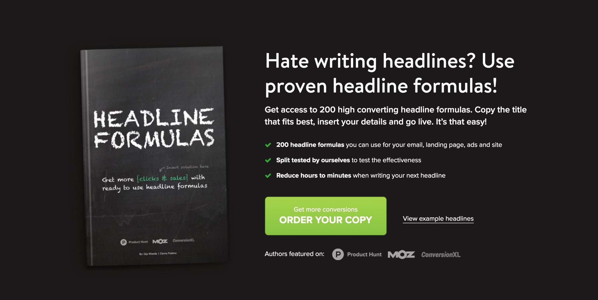
If you’re looking for a simple landing page for a Gumroad product… steal this one (breakdown):

If you have a Gumroad product you’re missing out on sales if you don’t have a custom page like this.
I’ve seen significant increases in conversion rate from doing this (doubled and tripled).
I’ll tell you how you can build it out yourself by ‘stealing’ this page. Let’s dive in!
The top section that you see is called the hero section.
Considering it’s the only section that everyone is guaranteed to see… it’s important.
The simplicity and colors here are GREAT.
But there are some things I would change…

Here’s what they did well: • great headline + subheading • benefit bullets above the fold • social proof in the form of credibility • bright action based CTA
Here’s what they could fix: • star rating above the headline with # of people that bought • testimonial below CTA
Have this section high up in your page is vital. It breaks down some pain points and shares an interesting story of how this product came to be.
They even weave in proof that these headlines are proven to work.
Check it out:

I love writing out the three main benefits with icons. It’s something I do on most of my pages.
The social proof is a great touch that can be put at the bottom of most sections.
Use lordicon.com if you need icons.
Read through what they did:

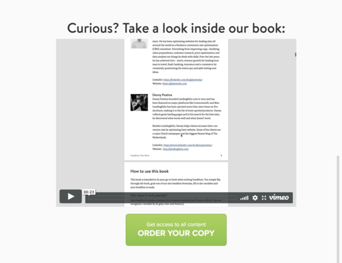
People want to see a little bit before they buy. By giving them a “sneak peek” you’re intriguing them more.
They put examples for different platforms and even included a video going over everything inside.
I do this on my pages by revealing chapter titles/lessons.

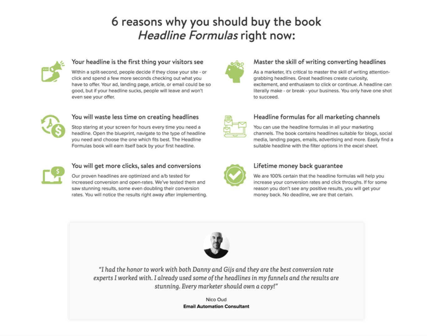
They cut out a bunch of sections by having this near the bottom.
They: • answer questions • handle objections • showcase a money back guarantee • include more social proof
You better be taking notes!
Simplicity at its finest:
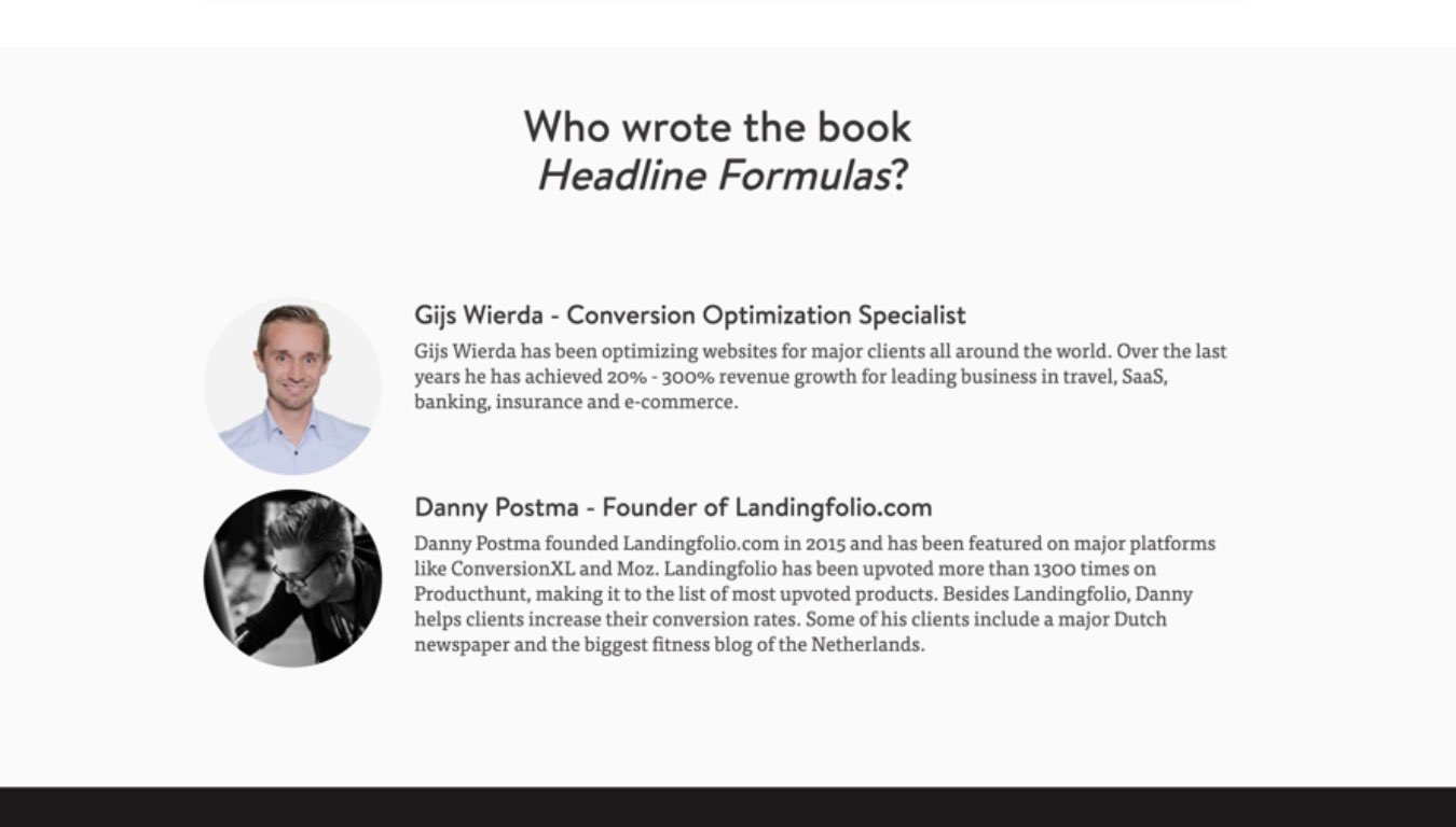
People would much rather buy a product from people than a company.
Sharing an “about us” is a great way of showing you’re human and connecting with them on a deeper level.
• show some personality • shine a light on your story • prove you’re an authority
It’s only $7 or $9?!
For a product this low in cost it’s okay to wait until the end to reveal the price.
They do a great job of showcasing everything you’re getting through the images and stating the benefits and features.
And the button stands out really well!

Since this is a Gumroad product they embed the checkout on the page.
You can do this by going to your widgets → modal → embed
Here’s an article with more info: help.gumroad.com/article/44-bui…
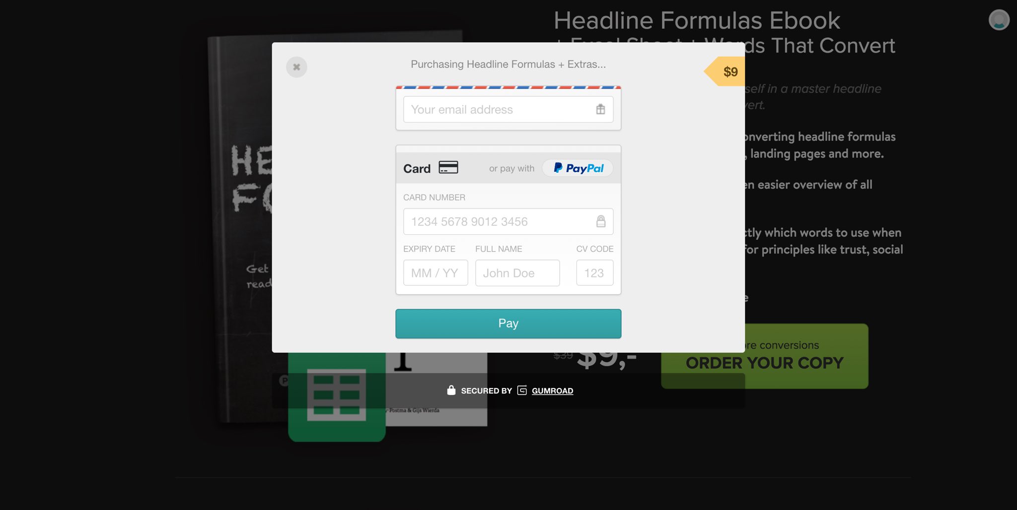
With such a low price point… This is meant to be an impulse purchase and probably converts well.
The only things I might add: • FAQ section • more social proof everywhere
Other than that it was great! A perfect page to ‘steal’ for your own product.
The full page (blurry):

If you need help transferring your page from Gumroad to a custom page like this let me know.
And if you need more inspiration for your own landing page…
Check out my private swipe file: swiftlanding.co/swipe-file
That’s all from me today. Follow me @LoftedLearning for more.